![]()
With the first of my software experimentations, I used Photoshop to create a logo for the gallery that incorporates the colour scheme that I observed on their website, that of dark grey, white and red. I did some initial research and found that the gallery does not have an official app or colour scheme, therefore decided to tackle this. First, I screenshotted the website and created new swatches for each colour and then used the best image of the logo from Google, however the image was not the right colour that of black, so I decided to fill each letter until I had the logo in both white and red. As I did not know the exact typeface used, I could not recreate the exact look of the logo and due to the process of filling each letter & the resizing of the original image, this caused the logo to have jagged edges. Overall, I find the position of the logos above and below in reverse to be quite effective, but if I were to go back to this concept, I would like to focus on the smoothing of these lines or recreating the logo with a more effective typeface.
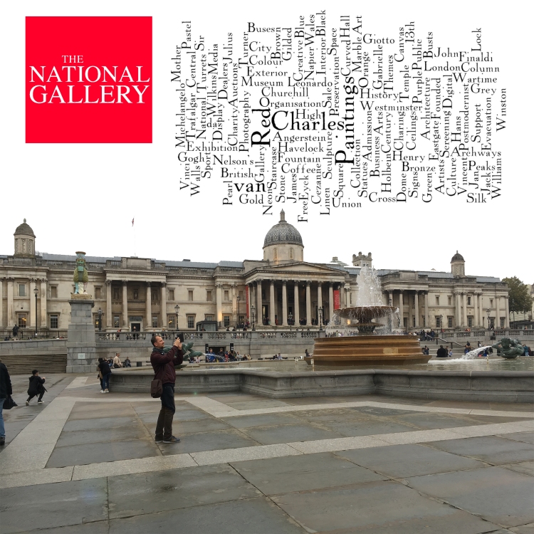
Next, I decided to create a word collage in Photoshop that followed these steps. First, I used words from my observations made in/around the building from the history, environment, colour scheme & artists to create a collage using the website Wordle.com and exporting the image. Then I used a photo that I took outside the building that proved effective with someone taking a photo upwards front stage, I cropped this and chose to use the magic wand to remove the colour of the sky in contrast with the collage that I had placed in the top right corner. I then created a square in the same red colour swatch and incorporated the logo in white and placed it in the top right corner. I wanted to create a word collage but thought it needed something more substantial that represents the building, so I decided to use a photograph I took myself and create some marketing material to compliment the image with text at the bottom inside a red square advertising free admission and the address.
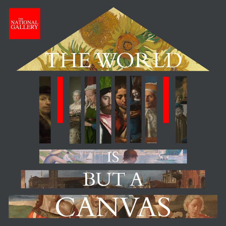
The next experimentation lead me to create a design of the building from a front angle using geometric shapes using the colour scheme I observed from the website. I wanted these shapes to be very minimalistic, symmetric with an element of hierarchy. First, I decided to use colours but decided against it in my education of the clipping mask technique learned in class. Using official images of paintings that are exhibited at the gallery from the website, I downloaded a selection that I saw as effective; size and colour wise and incorporated them into the design, arranging the perspective of each image. I decided to place a logo that I had created in the top left corner from previous experimentations and chose to represent the flags that hang on each side of the building with red rectangles. I then decided that something was needed to finish the design by filling in the space with text, I did some research into quotes from famous painters and settled on ‘the world is but a canvas’ from Henry David Thoreau and incorporated this into the design by choosing a similar typeface to the official logo.
![]()
With this design, I wanted to recreate the building using geometric shapes very similar to what was achieved in the last experimentation in more detail without the use of lines and only with shapes. I created the building using the colours that I had observed of the actual masonry from photos that I had taken, with attention to detail such as the design of the stonework from the dome & peaks to the flags and entrances. The design is quite appealing to the eye due to its symmetricity, however, later I felt that the use of a specific colour scheme would help in its effectiveness rather than choosing random swatches that I felt represented what I saw from photos, as real-life colour does not necessarily correlate over to digital design. With my later understanding of the history of design movements learned in class, certain movements such as Bauhaus & Art Deco naturally appealed to me and thus felt inspired to experiment and conduct the appropriate research to try my hand at this style of design with the last one and my ultimately my final piece.

My last experimentation lead me to design the building in a Bauhaus inspired style that preceded by final piece. Using a specific Bauhaus colour scheme using pastel colours, I recreated the building from a front angle using geometric shapes both filled and unfilled using different strokes. I designed a man’s face from one observed by a Bauhaus Illustrator using black rectangles looking at a painting inside of a dark frame with red background in the top right-hand corner. To represent the font of the logo and title, I had to download a new typeface that is essential to the style of Bauhaus from the website dafont.com that I incorporated into the image. I found this design very appealing to the eye and want to conduct more research into the exact details of the style regarding 3d design & offset shapes by contacting some illustrators in which is an area of expertise.
